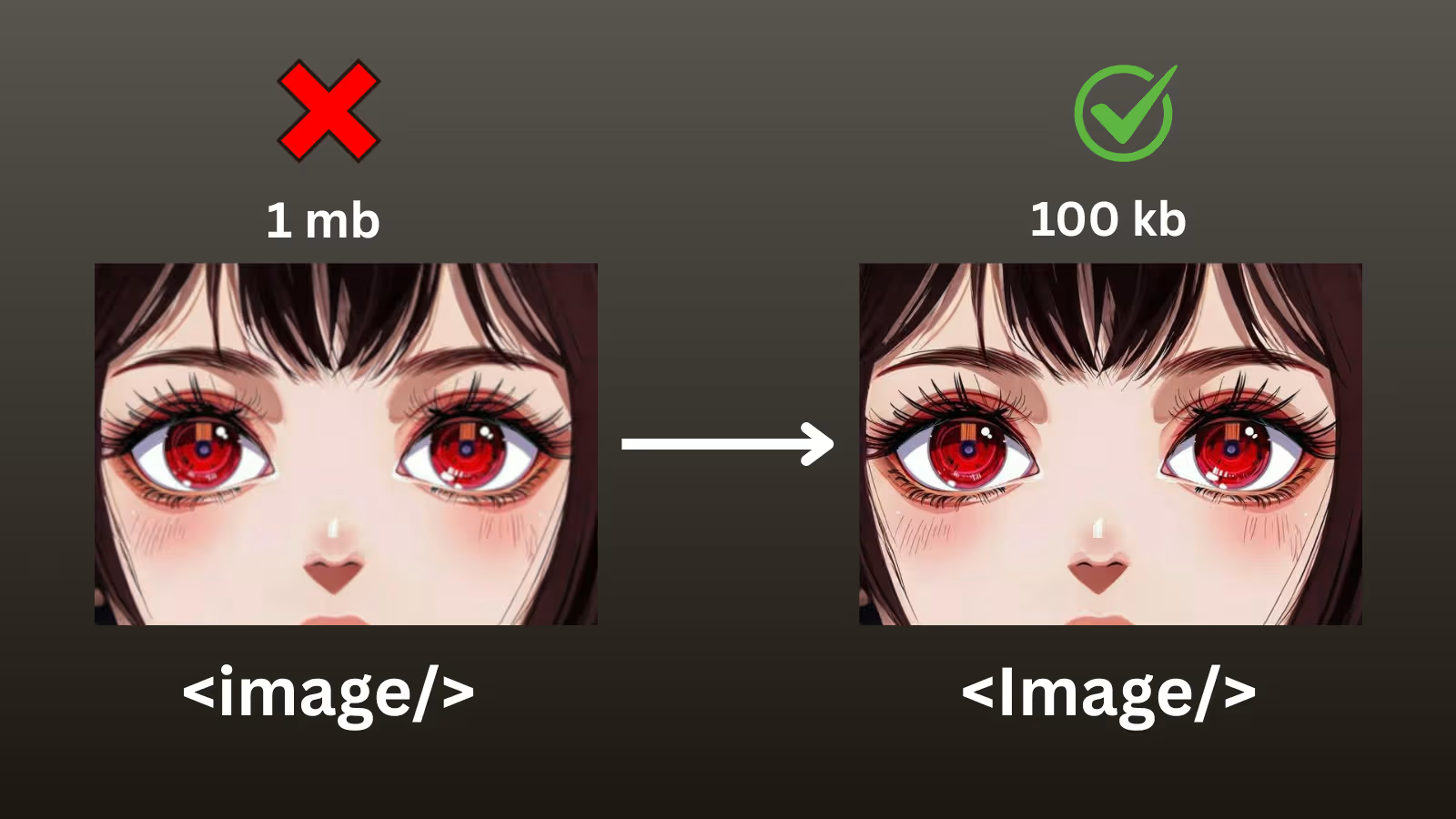
Images often make up the largest part of a website's loading time. The Next.js Image component solves this by automatically optimizing images for better performance and user experience.
The Problem with Traditional Images
Traditional HTML img tags load images as-is, regardless of the user's device or connection speed. This leads to several performance issues:
- Large images slow down page loading
- Users on mobile devices download desktop-sized images
- No automatic format optimization
- Layout shifts as images load
How Next.js Image Component Solves These Issues
The Next.js Image component is much smarter than traditional image tags. It automatically:
Serves Appropriately Sized Images
Next.js automatically generates multiple sizes of your images and serves the most appropriate one. A mobile user gets a smaller image, while desktop users get higher resolution versions.
Implements Modern Format Conversion
The component converts images to modern formats like WebP when supported by the browser, significantly reducing file sizes without quality loss.
Provides Built-in Lazy Loading
The Image component implements lazy loading by default. This means images only load when they're about to enter the viewport, making your initial page load much faster.
Prevents Layout Shift
The component prevents layout shift by requiring you to specify dimensions. This ensures your page doesn't jump around as images load, providing a better user experience.
Basic Usage
Here's how to get started with the Next.js Image component:
import Image from 'next/image'

export default function ProfilePage() {
  return (
    <div>
      <h1>User Profile</h1>

      {/* Basic usage with local image */}
      <Image
        src="/profile-photo.jpg"
        alt="User profile photo"
        width={400}
        height={300}
      />

      {/* Priority loading for above-the-fold images */}
      <Image
        src="/hero-banner.jpg"
        alt="Hero banner"
        width={1200}
        height={600}
        priority // Loads immediately, not lazy
      />
    </div>
  )
}
Working with Remote Images
When using images from external domains, you need to configure your next.config.js file:
// next.config.ts - Configure allowed domains
module.exports = {
  images: {
    domains: [
      'example.com',
      'cdn.example.com',
      'images.unsplash.com',
      'avatars.githubusercontent.com'
    ]
  }
}
Component using remote images:
import Image from 'next/image'

export default function ProductGallery({ products }) {
  // Short blur data URL to prevent overflow
  const blurDataURL = "data:image/jpeg;base64,/9j/4AAQSkZJRgABAQAAAQABAAD//2Q=="

  return (
    <div className="product-grid">
      {products.map(product => (
        <div key={product.id} className="product-card">
          <Image
            src={product.imageUrl}
            alt={product.name}
            width={300}
            height={300}
            placeholder="blur"
            blurDataURL={blurDataURL}
          />
          <h3>{product.name}</h3>
          <p>${product.price}</p>
        </div>
      ))}
    </div>
  )
}
Responsive Images with Fill
For full-width responsive images, you can use the fill prop:
import Image from 'next/image'

// Hero section with full-width responsive image
export default function HeroSection() {
  return (
    <div className="hero-container">
      <div className="hero-image-wrapper">
        <Image
          src="/hero-background.jpg"
          alt="Hero background"
          fill // Fills the parent container
          style={{
            objectFit: 'cover'
          }}
          priority
        />
        <div className="hero-content">
          <h1>Welcome to Our Site</h1>
          <p>Amazing content goes here</p>
        </div>
      </div>
    </div>
  )
}
Advanced Configuration
For maximum performance, you can configure advanced image settings:
// next.config.js - Advanced image configuration
const imageConfig = {
  images: {
    domains: ['example.com'],
    deviceSizes: [
      640, 750, 828, 1080,
      1200, 1920, 2048, 3840
    ],
    imageSizes: [
      16, 32, 48, 64,
      96, 128, 256, 384
    ],
    formats: ['image/webp'],
    minimumCacheTTL: 60,
    dangerouslyAllowSVG: true,
    contentSecurityPolicy:
      "default-src 'self'; script-src 'none'; sandbox;"
  }
}

module.exports = imageConfig
Key Features and Best Practices
Priority Loading
Use the priority prop for above-the-fold images to load them immediately instead of lazy loading.
Placeholder Images
Implement blur placeholders to improve perceived performance while images load.
Proper Alt Text
Always include descriptive alt text for accessibility and SEO benefits.
Responsive Sizing
Use the sizes prop to tell the browser which image size to download based on the viewport.
Event Handlers
Use onLoad and onError callbacks to handle image loading events and provide fallbacks.
Performance Benefits
By using the Next.js Image component consistently throughout your application, you'll see:
- Faster Page Loads: Only necessary images load initially
- Reduced Bandwidth: Appropriately sized images for each device
- Better Core Web Vitals: Improved LCP and CLS scores
- Enhanced User Experience: No layout shifts and faster perceived performance
Common Pitfalls to Avoid
Missing Dimensions
Always specify width and height for local images to prevent layout shift.
Not Configuring Domains
Remember to add external domains to your next.config.js file.
Overusing Priority
Only use priority for above-the-fold images to avoid slowing down initial page load.
Ignoring Alt Text
Always provide meaningful alt text for accessibility and SEO.
Conclusion
For optimal performance, always use the Next.js Image component instead of regular img tags in your Next.js applications. The performance gains are significant and the API is straightforward to use.
The Image component is one of the most impactful optimizations you can implement in your Next.js application. By leveraging its automatic optimizations, you'll provide users with faster loading times and a better overall experience while improving your site's search engine rankings.